Anatomy of a Phish
The Tip
This week will be a little different. Last week, as many of you know by now, we sent a simulated phish test out to the portion of our community that is support staff and full-time faculty. This was the second test in about 7 months and was designed to measure the progress/results from the 3rd-party training we are providing to this group, as well as through these Cybersecurity newsletters. Although we have seen growth since our first test, there is always room for improvement.
This test was designed to be a 4 out of 5 on the ‘difficult to detect’ scale. It was intentionally designed to mimic an email from UTS, as that would be trivial for any real phishing campaign targeted towards us, and it is the most likely vector for a casual attack.
There were several red flags built in to this simulation that we can all learn from. Let’s have a look at those below.
Any one of these red flags seen in an email is enough to stop you from acting on it. When receiving a suspicious email, report it to UTS and delete it. You can always retrieve it out of the trash if it was legitimate. We are thankful to those who reported the suspicious email to UTS.
The Detail
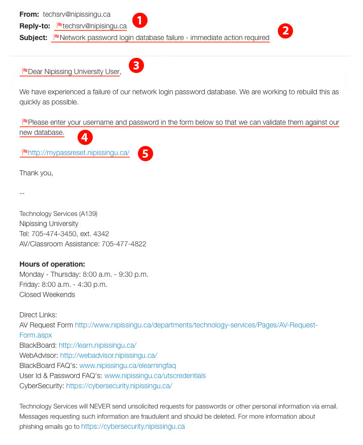
Here is a screen capture of the phish test we sent last week, with the red flags hi-lighted. Each point is discussed below.

- Misspelled domain name in the replyto address (spoofed domain)
- Call for immediate action with implied urgency
- Impersonal or ambiguous salutation
- This is something we would never do, and inform people of this in the footer of every email we send, including this phish attempt
- Hovering over the link revealed that the actual link destination does not match the displayed text
Depending on the browser you use to check webmail, or the email client you use, you may also have seen other warning signs. For instance, I believe gmail in all browsers showed the email was sent through a delegate and not actually techserv. I’ve heard reports that the Chrome browser put a red bar near the top warning about the link mismatch. My email client put a large red bar over the link when hovering over it, to caution me about the mismatch. Other browsers and email clients may do similar things to help. It’s worth taking a few minutes to get completely familiar with some of these built-in defences, as well as learning to spot the red flags.